Overview
Service Description
In today's dynamic digital landscape, where users access websites through a myriad of devices, the importance of a seamless user experience cannot be overstated. Welcome to the world of responsive design, a harmonious fusion of aesthetics and functionality. This approach empowers websites to adapt seamlessly across an array of screens, embracing everything from the compact dimensions of smartphones to the expansive vistas of tablets.
Responsive design is about unifying the user experience across devices. It transcends the limitations of designing for a single screen size, ensuring that your website's elegance and usability remain consistent, irrespective of the device in use. Whether visitors engage with your content on a bustling train ride through their smartphones or leisurely explore it on a tablet at home, the experience remains uniformly satisfying.
TheThe heart of responsive design lies in fluid layouts that gracefully accommodate varying screen dimensions. This isn't just about fitting content; it's about optimizing the visual impact and readability of images, text, and interactive elements. Fluid layouts intuitively adjust, guaranteeing that every piece of content retains its allure and engages users effortlessly.
User-centric navigation and interaction are pivotal in the mobile landscape. Touch and swipe gestures reshape how users engage with digital content. Prioritizing this, I tailor buttons, menus, and interactive components to facilitate intuitive interactions, thereby enhancing user engagement and satisfaction.
In the realm of mobile users, speed is a crucial factor. This is where responsive design comes into play. It's not merely about aesthetics; it's about optimizing performance. I engineer websites that load swiftly, even on mobile networks. By doing so, we elevate user experience, reduce bounce rates, and foster positive interactions.
Beyond visual appeal, responsive design has a significant impact on SEO and accessibility. Search engines favor mobile-friendly websites in search results. With responsive design, your website gains a competitive edge by enhancing user experience and increasing the likelihood of higher search engine rankings. Moreover, by embracing a unified design, accessibility is ensured for users with disabilities across all devices.
Responsive design is about future-proofing your digital presence. As technology evolves, new devices and screen sizes emerge. Responsive design ensures your website adapts effortlessly to these changes, sparing you the need for constant redesigns and investments.
The efficiency of management is another advantage. Handling a single website is far more efficient than managing multiple versions for different devices. With responsive design, updates and changes are implemented holistically, streamlining maintenance and ensuring consistency.
Maintaining consistent branding and messaging across devices is vital. Your brand's identity should resonate seamlessly. With my expertise, I ensure your brand's aesthetics, messaging, and tone remain cohesive, regardless of the device users employ to access your website.
Responsive design is more than a technical solution; it's a holistic approach to crafting a harmonious digital presence. It's about merging design aesthetics with functional excellence. Your website becomes an interconnected canvas where design and utility intersect, captivating users and delivering an experience that stands out.
Through my responsive design service, your website evolves into an entity that bridges device divides. As we optimize and fine-tune your website for mobile and tablet interfaces, your audience will embark on a seamless digital journey – one that captivates them whether they're using a smartphone or a tablet. The result is an elevated user experience and strengthened engagement through the art of responsive design.
What you'll Get
Requirements
Frequently Asked Questions
Why is responsive design important for my website?
-
 Responsive design is essential because it ensures your website provides a seamless user experience across various devices. With the increasing diversity of devices, from smartphones to tablets, responsive design adapts your website's layout and content to fit perfectly on any screen size. This not only improves user engagement but also boosts SEO rankings, as search engines favor mobile-friendly websites.
Can you explain the difference between responsive design and a separate mobile app?
-
Responsive design involves creating a single website that adapts to different screen sizes and devices. On the other hand, a separate mobile app is a standalone application specifically designed for mobile devices. While apps can provide unique functionalities, responsive design offers a unified web presence without the need for users to install additional software. It's a cost-effective way to reach a broader audience.
Will responsive design affect the loading speed of my website?
-
On the contrary, responsive design often improves loading speed. By optimizing layouts and content for different devices, responsive design reduces the need for excessive resizing, and the website loads faster. This is crucial for user satisfaction and SEO, as search engines consider page speed as a ranking factor. Responsive design ensures a fast and smooth experience for your visitors.
Reviews

Ray Alphonce
Client
"Leacky's expertise in responsive design truly transformed our website's user experience. The seamless transition between different devices is remarkable, and our visitors are enjoying a consistent, visually appealing journey. The optimization for mobile and tablet screens has significantly improved engagement and reduced bounce rates. Leacky's attention to detail and commitment to user-centric design make them a top choice for anyone seeking to elevate their online presence."
Reply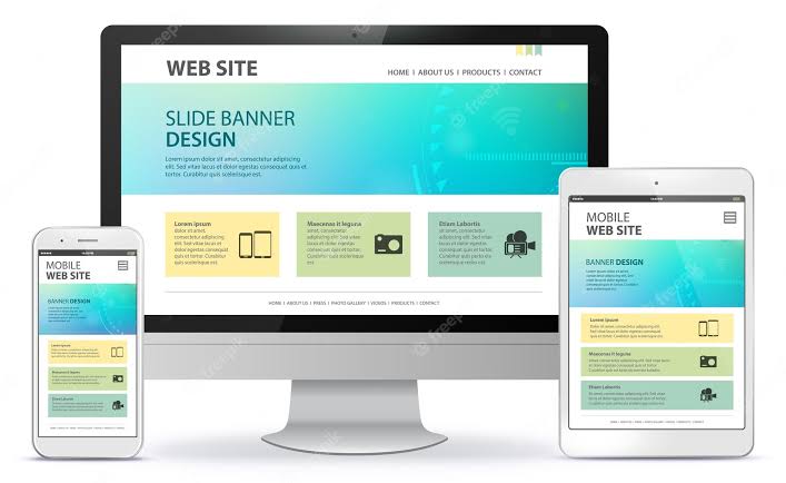
Post A comment